When it comes to designing your baby’s nursery, CW Home editor Allison Turnbull has pulled together some expert tips to ensure the transition is as seamless – and stylish – as possible.

Being able to mimic the night-time at any time in a baby’s room also helps to create the ideal environment for sleep.
Developing a design plan is a must as it not only allows you to cover off those non-negotiable nursery items, but also keeps you aligned with your budget.
With so much room for creativity, here are three key things to consider when designing your baby’s nursery:
Pick a theme
A good first step is to set a theme, while striking a balance between practicality and trend. An easy way to do this is to choose a gender-neutral colour for your walls.
Oversized murals and feature walls are popular, reflected through colour pops pulled from them and echoed across the room. Floral and natural prints, such as leaves and trees, are a favourite, bringing in a hint of the outside.
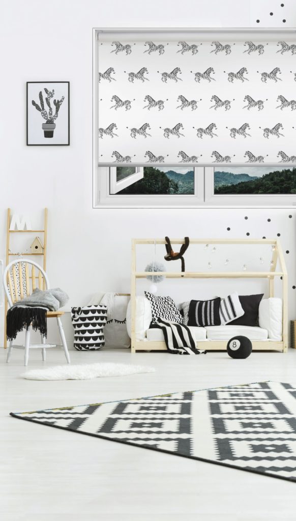
Many people are becoming bolder with their blind choices, choosing patterned and textured blinds when styling rooms, while monochrome continues to be a popular choice.
Safety first
Safety in your baby’s room is a number one priority. By designing a safe space from the get-go, you can factor in things like trip hazards, sharp corners and cupboard locks, right through to ensuring your window coverings are child-safe and cord-free.
The workstation
A key consideration when planning your nursery is to keep everything easily accessible from one central point. Nappies, wipes, clothes, change table covers, bin, bub’s favourite teddy – it all needs to be at arm’s length.
If bottle feeding (expressed breastmilk or formula), a fridge in your baby’s room can be a gamechanger. You could create a mini workstation, including bottle steriliser and warmer, fridge, bottle stash, etc. – ideal for those late night feeds or emergencies. By having an easily-accessible feeding area, you’ll need fewer trips to the kitchen, resulting in more relaxed, well-rested parents and happy baby.
Design inspo
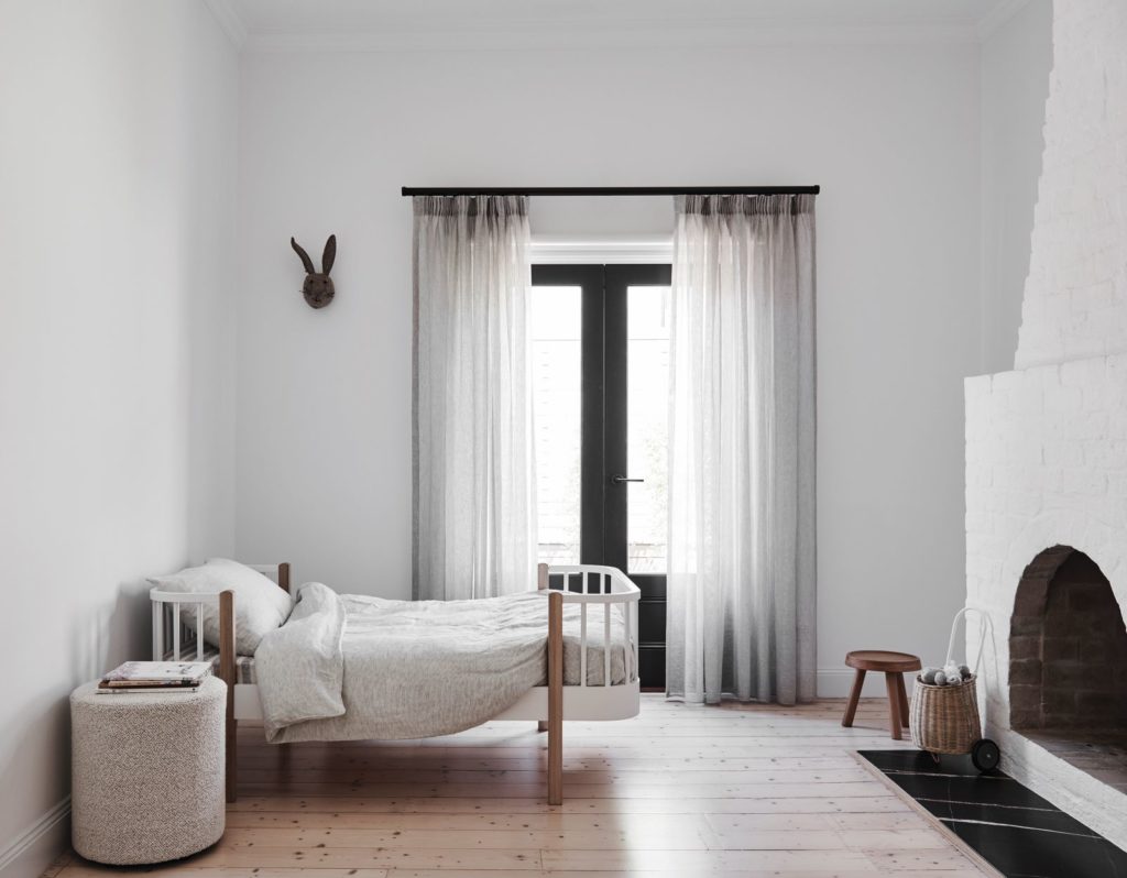
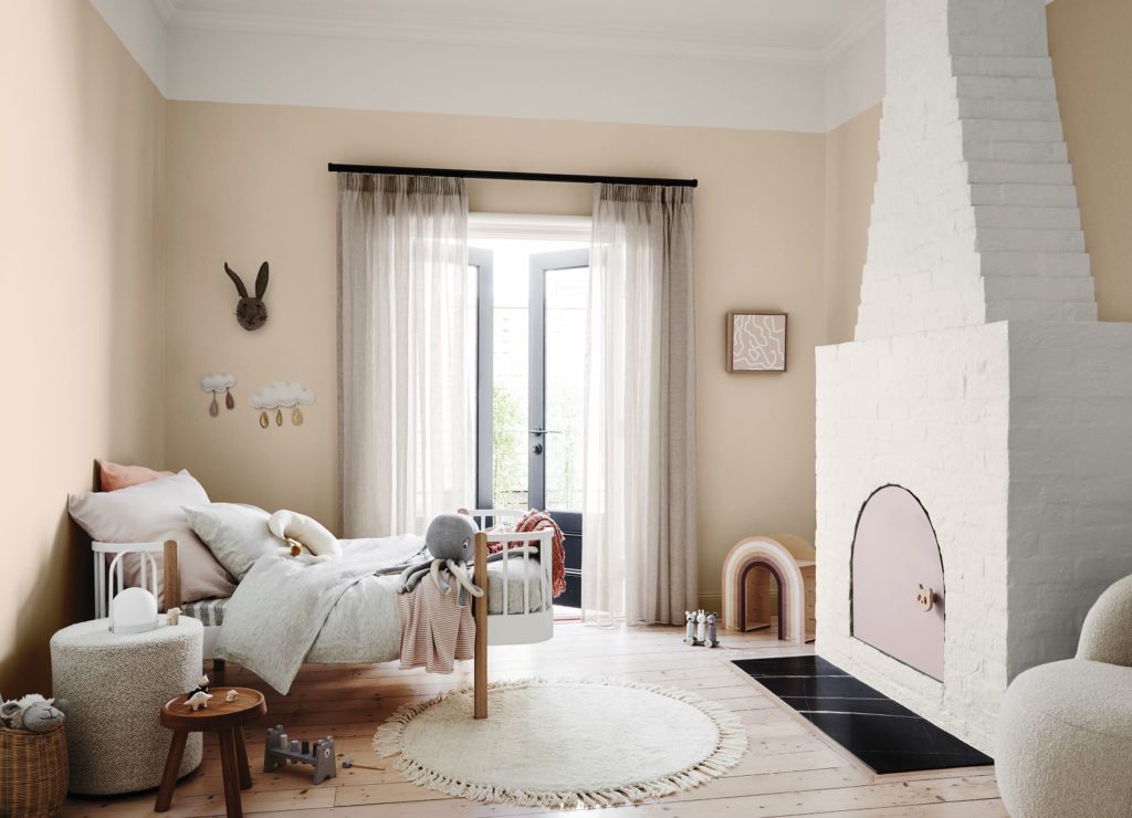
Stylist Bree Leech transformed a bland, all-white kid’s bedroom using the Dulux Grounded palette which combines gentle, earthy neutrals and warm whites with accents of soft coral and lavender to create a cosy, laid-back feel.
“This bedroom’s all-white palette made it feel a little uninviting – the exact opposite of what you want in a child’s room. The room itself has great features, including a high ceiling, a beautiful, solid timber floor, French doors, plenty of natural light and a striking brick fireplace,” Bree said.
“I wanted to add warmth and personality to the space so that its little occupant would enjoy spending time here. I aimed to highlight the room’s best features, detract from the less appealing ones – and spend next to nothing. To keep the budget in check, we kept the main pieces of furniture – a feature toddler bed with timber detailing and a curvy armchair and ottoman.”
Andrea Lucena-Orr, Dulux colour and communications manager, added, “it’s important not to add too much clutter to a child’s room, particularly if it’s small, as you want to give them space to relax and play. We left plenty of breathing space and kept the sheer linen curtains to allow soft light to filter in”.
More stories like this:


