The 2024 Dulux Colour Forecast has been unveiled, drenched in rich golds, olive greens, and reddish browns that reveal a collective yearning for warm and nurturing home environments.
It’s the 25th anniversary of the Forecast, which has thus far been on the money in predicting the reign of ‘Millennial Pink’ in 2019, and the ‘Greige’ minimalism of 2017.
“We can see yellow and rich gold becoming more prominent in this year’s palettes … The zesty green and clay brown shades that we saw coming through in the 2023 Colour Forecast are transitioning to a warmer space, featuring yellow and subtle red undertones,” says colour forecaster Bree Leech.
“The majority of shades are mid-tone with darker shades predominantly used for small accents. The warmth we’re seeing across each of the 2024 Colour Forecast palettes is the answer for consumers who are looking to add positivity by adding colour in their homes.”
According to Leech, pastels and bright hues are out, and while the nostalgic references to design eras past can stay, they must be “sophisticated”.
The feature wall is also being left behind in 2024. Dulux colour and communications manager Andrea Lucena-Orr says mid-tones are best used on all four walls, particularly in bedrooms and living spaces.
And without further ado, introducing the on-trend trio of 2024 colour palettes:
Solstice
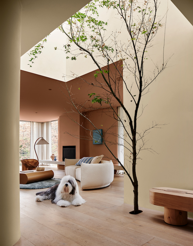
Solstice is a toasty palette of rich browns, clay and warm neutrals with a sun loving yellow as an accent, designed to evoke a comforting and familiar feeling.
“This trend embodies a harmonious blend of cosy and calm styling elements, with captivating material highlights like natural stone, ceramic and highly textured fabrics,” Lucena-Orr explains.
According to Leech, Solstice starts with inspiration from the pared back Scandi style but adds a Mediterranean and desert influence. “From the Australian outback to the African savannah, the palette brings together warm colours with cooler accents and tactile details, such as braiding and primitive sculptural forms.”
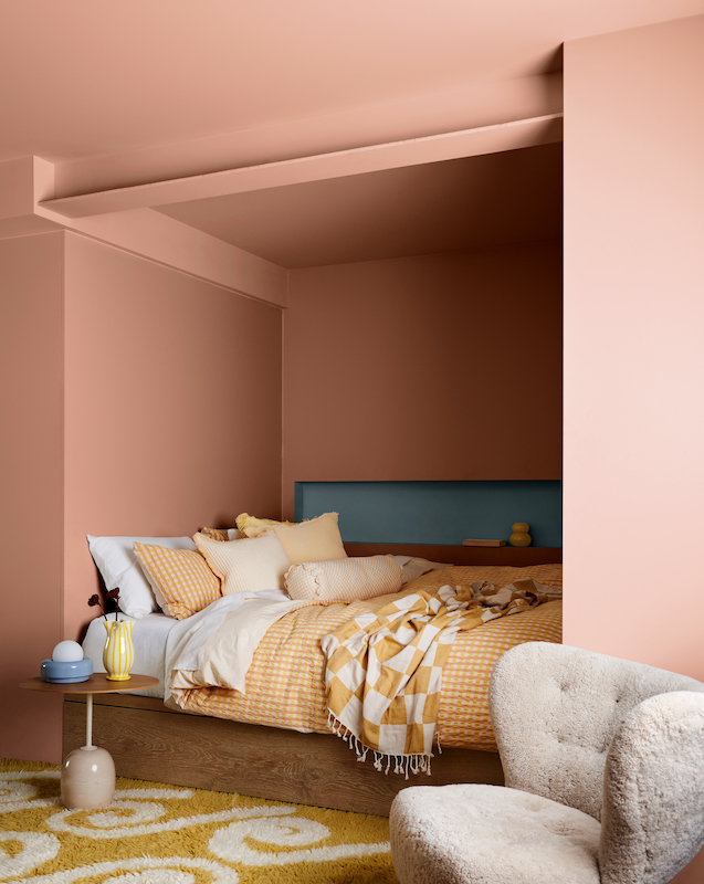
Journey
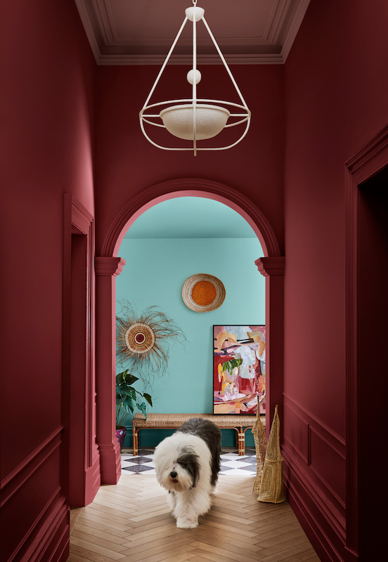
The Journey palette is inspired by a lockdown-fuelled desire to be worldly vagabonds who still manage to have a gorgeous homebase filled with eclectic souvenirs.
“Olive greens and mustard yellow shades are prominent hues within the Journey palette, with dusty blues and rich burgundy acting as accents within a mix of faded and soft textured furnishings and handmade pieces including painted wicker,” says Lucena-Orr.
Leech adds that “the Journey palette has a much more eclectic and maximalist feel and brings together global influences to reflect on the history of our ancestry through objects and items handed down through time.”
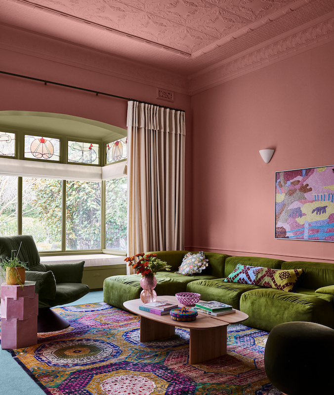
Muse
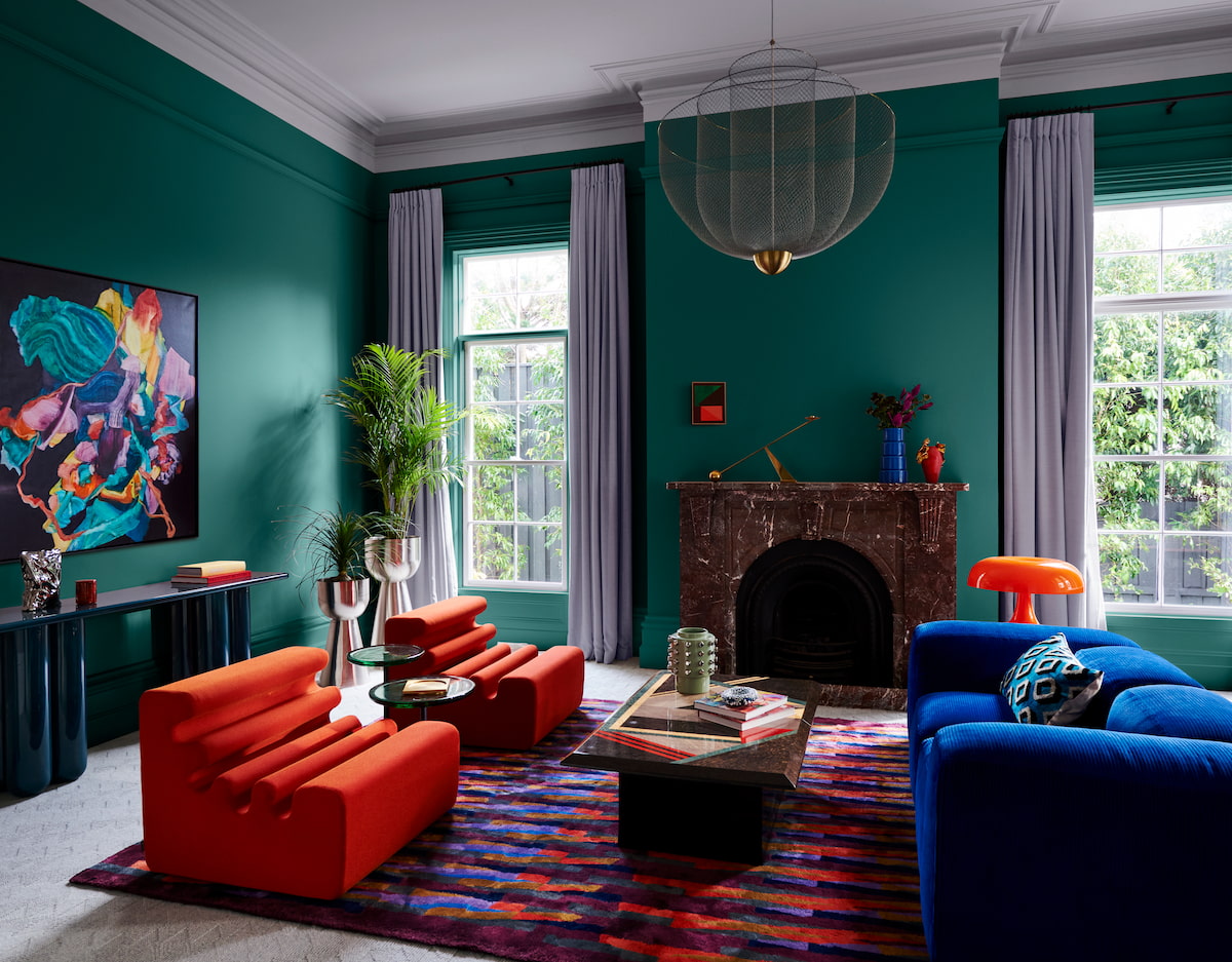
Heavily influenced by the nostalgia of the postmodern era, with a particular emphasis on the 1970s, the Dulux Muse palette is a celebration of modernising the free-spirited styles of the past. “We reimagine past trends with vintage pieces, to create an interior that feels unmistakably contemporary,” explains Lucena-Orr.
“The Muse palette is a colourful array of hues predominantly in the mid-tone with warm brown and rich tans, accented with deep blues and soothing greens, to create a distinctly modern interior that has been fused with nostalgic design references reminiscent of the ‘60s to the ‘80s, in addition to the textures and glamour from the ‘70s.”
Get all the latest Canberra news, sport, entertainment, lifestyle, competitions and more delivered straight to your inbox with the Canberra Weekly Daily Newsletter. Sign up here.